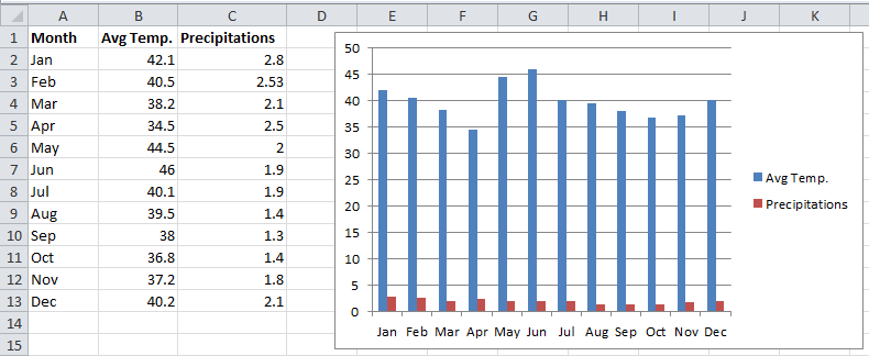
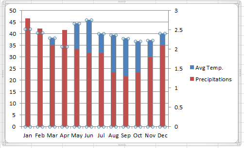
Typically, a chart uses a single style: a column chart, a line chart, or a pie chart, for example. If your chart has more than one data series, you might want to display multiple styles within the same chart — a combination chart. Below figure shows a chart that’s a good candidate for a combination chart.
The chart shows average temperature and precipitation, by month. But there’s a problem. The two ranges of data vary in magnitude, so the precipitation columns are barely visible in the chart.
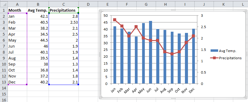
Below figure shows the chart after I converted it to a combination chart. In this chart, the precipitation values are depicted with a line, and it uses a second vertical axis on the right. Most would agree that this chart is a vast improvement over the original.
You can search the Excel Ribbon all day, and you won’t find a command to create a combination chart. If you already created your chart (that has at least two data series), you can easily convert it to a combination chart. Follow these steps:
1. Click the series that you want to change.
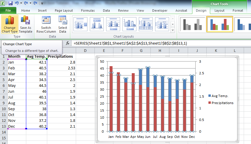
2. Choose Chart Tools➜Design➜Type➜Change Chart Type.
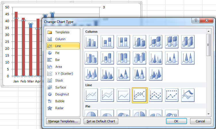
3. In the Change Chart Type dialog box, choose the icon that represents the chart type for the selected series.
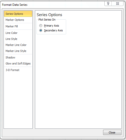
4. If you’d like to use a second vertical axis for the converted series, select the series and press Ctrl+1 to display the Format Data Series dialog box; click the Series Options tab and select Secondary Axis.
The chart in first Figure started out as a standard column chart with two series. A few mouse clicks later, one of the series (named Precipitation, in this case) is converted from columns to a line. I also added a secondary axis and labeled the axes to make it perfectly clear which scale is used for which series. To add axis titles, use Chart Tools➜Layout➜Axis Titles.
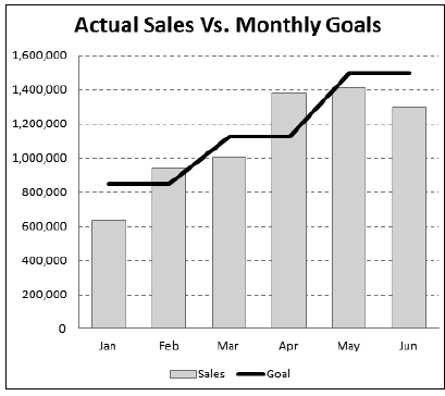
Below Figure shows another combination chart. This chart combines a column chart and a line chart, and both series use the same vertical axis. In this case, depicting the monthly sales goal as a line chart makes it easier to identify the months in which the goal was met.
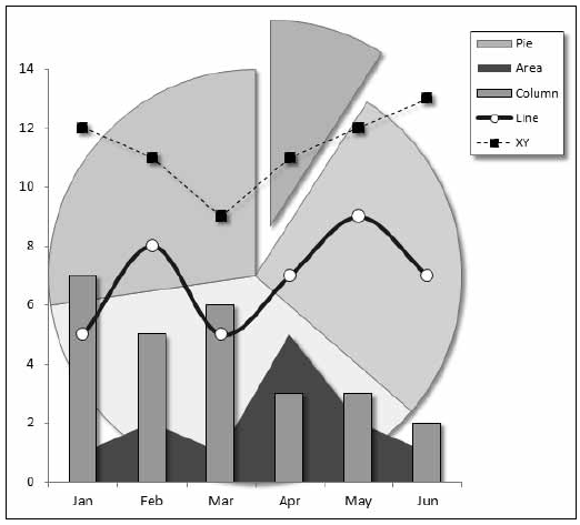
Below Figure shows how far you can go with a combination chart. This chart combines five different chart types: Pie, Area, Column, Line, and XY. I can’t think of any situation that would warrant such a chart, but it’s an interesting demo.
In some cases, you can’t combine chart types. For example, you can’t create a combination chart that involves a bubble chart or a 3-D chart. If you choose an incompatible chart type for the series, Excel lets you know.
