Freezing a Chart
Normally, an Excel chart uses data stored in a range. Change the data, and the chart is updated automatically. Usually, that’s a good thing. But sometimes you want to “unlink” the chart from its data range to produce a static chart — a snapshot of a chart that never changes. For example, if you plot data generated by various what-if scenarios, you might want to save a chart that represents a baseline so that you can compare it with other scenarios. You can freeze a chart in two ways:
- Convert the chart to a picture.
- Convert the range references to arrays.
Converting a chart into a picture
To convert a chart to a static picture, follow these steps:
1. Create the chart as usual and format it the way you want.
2. Click the chart to activate it.
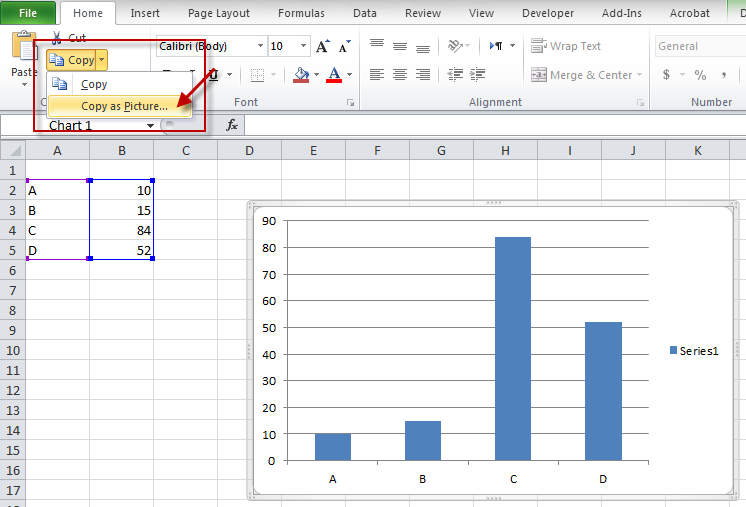
3. Choose Home➜Clipboard➜Copy➜Copy As Picture.
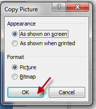
4. In the Copy Picture dialog box, accept the default settings and click OK.
5. Click any cell to deselect the chart.
6. Press Ctrl+V to paste the picture at the cell you selected in Step 5.
The result is a picture of the original chart. This chart can be edited as a picture, but not as a chart. In other words, you can no longer modify properties such as chart type and data labels. It’s a dead chart — just what you wanted.
Converting range references into arrays
The other way to unlink a chart from its data is to convert the SERIES formula range references to arrays. Follow these steps:
1. Activate your chart.
2. Click the chart series. The Formula bar displays the SERIES formula for the selected data series.
3. Click the Formula bar.
4. Press F9 and then press Enter.
Repeat these steps for each series in the chart.
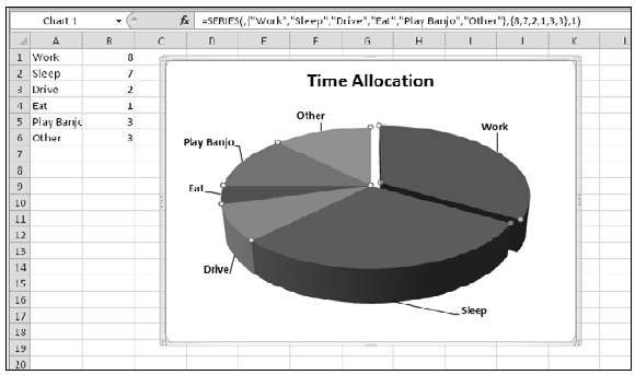
Figure 148-1 shows a pie chart that has been unlinked from its data range. Notice that the Formula bar displays arrays, not range references. The original data SERIES formula was
=SERIES(,Sheet3!$A$1:$A$6,Sheet3!$B$1:$B$6,1)
The converted SERIES formula is
=SERIES(,{“Work”,”Sleep”,”Drive”,”Eat”,”Play Banjo”,”Other”},{8,7,2,1,3,3},1)
Note: Excel places a limit on the length of a SERIES formula. Therefore, this method may not work if the series consists of a large number of data points.
Figure 148-1: This chart isn’t linked to a data range.
Creating Picture Effects with a Chart
When you copy a chart as a picture, it opens the door to some creative effects that are possible with pictures, but not with charts.
To create a picture from a chart, select the chart and choose Home➜Clipboard➜Copy➜Copy As Picture. Then click a cell and press Ctrl+V (see Tip 148 for additional information).
When you select the picture, Excel displays its Picture Tools contextual menu. You can use all of the tools in Picture Tools➜Format, plus those available in the Format Picture dialog box (displayed when you press Ctrl+1).
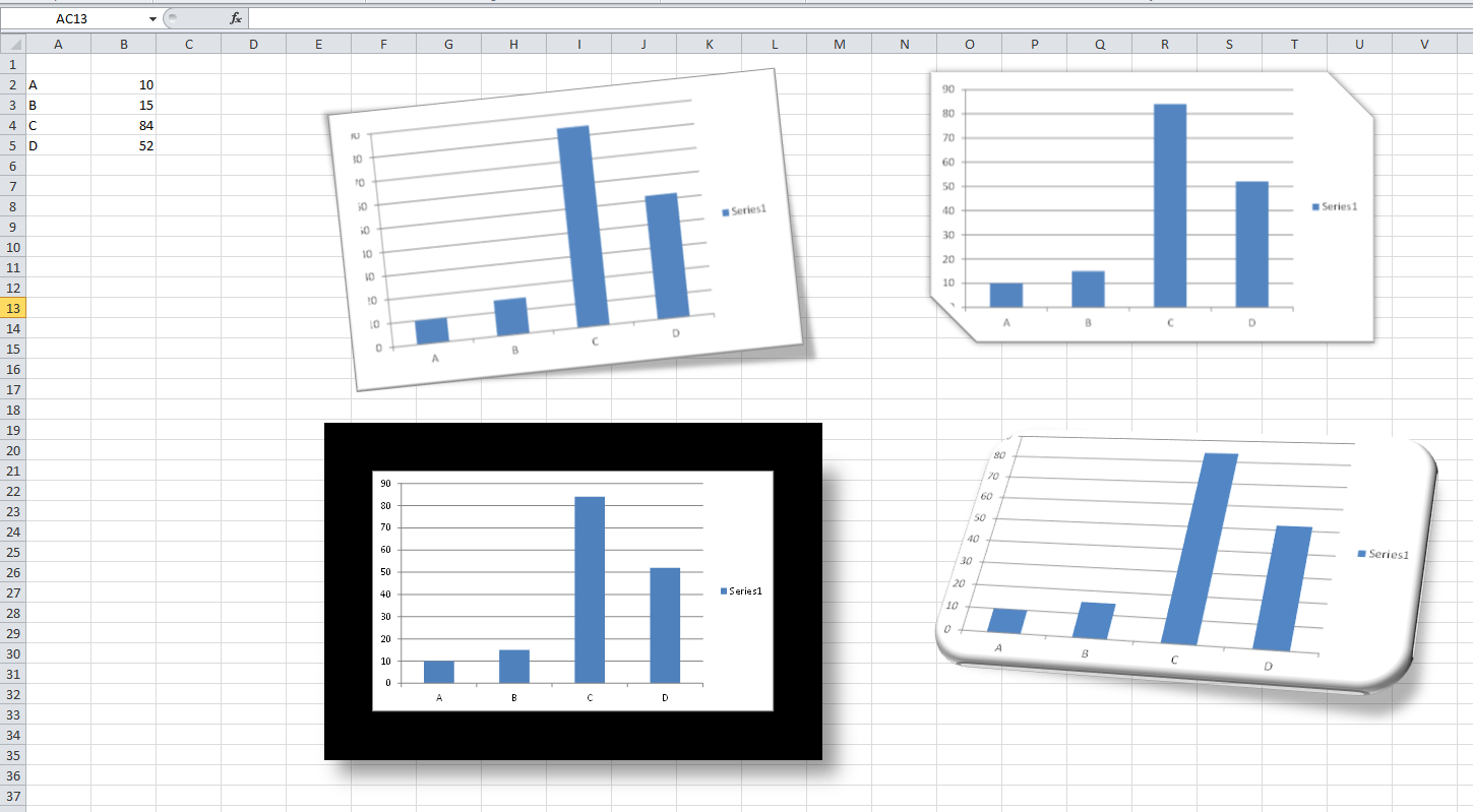
Figure 149-1 shows a few examples of picture styles applied to a chart that was copied as a picture.
Figure 149-1: Applying picture styles to a chart that was copied as a picture.
Creating Sparkline Graphics
One of the new features in Excel 2010 is Sparklines graphics. A Sparkline is a small chart displayed in a single cell. A Sparkline lets you quickly spot time-based trends or variations in data.
Because they are so compact, Sparklines are often used in a group. Although Sparklines look like miniature charts (and can sometimes take the place of a chart), this feature is completely separate from Excel’s charting feature. For example, charts are placed on a worksheet’s draw layer, and a single chart can display several series of data. A Sparkline is displayed inside of a cell, and it displays only one series of data.
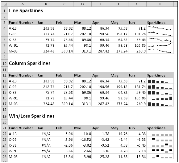
Figure 150-1 shows examples of each of the three types of Sparkline graphics, displayed in column H. Each Sparkline depicts the six data points to the left.
Figure 150-1: Examples of Sparkline graphics.
The three types of Sparklines available in Excel 2010 are:
- Line: Similar to a line chart. As an option, the line can display with a marker for each data point. The first group shows line Sparklines, with markers. A quick glance reveals that with the exception of Fund Number W-91, the funds have been losing value over the sixmonth period.
- Column: Similar to a column chart. The second group shows the same data displayed with column Sparklines.
- Win/Loss: A binary-type chart that displays each data point as a high block or a low block.The third group shows win/loss Sparklines. Notice that the data is different. Each cell displays the change from the previous month. In the Sparkline, each data point is depicted as a high block (win) or a low block (loss). In this example, a positive change from the previous month is a win, and a negative change from the previous month is a loss.
To create Sparkline graphics, select the data that will be depicted. Then choose Insert➜parklines and click one of the three Sparkline types: Line, Column, or Win/Loss. Excel displays the Create Sparklines dialog box, where you specify the location for the Sparklines.
Typically, you’ll put the Sparklines next to the data, but that’s not a requirement. Most of the time, you’ll use an empty range to hold the Sparklines. However, Excel does not prevent you from inserting Sparklines into cells that already contain data. The Sparkline location that you specify must match the source data in terms of number of rows or number of columns.
After you create some Sparklines, you have a fair amount of control over their appearance. Use the tools in the Sparkline Tools Design tab (which appears when you select a cell that contains a Sparkline).
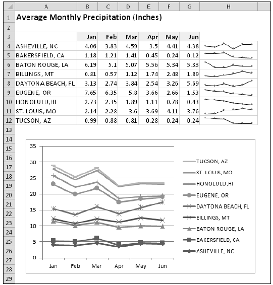
Figure 150-2 shows a group of Sparklines in the range H3:H12, plus a line chart that uses the same data. The line chart is a bit jumbled, but it’s a better choice if you want to compare the cities. The Sparklines, on the other hand, are useful for showing trends for a single city.
Figure 150-2: A group of Sparklines, and a line chart that shows the same data.
